
Getting Started with Your First HTML Page
A beginner’s walkthrough of basic HTML structure. We’ll cover tags, attributes, and the foundation every web page needs to exist.
Web Design Fundamentals
Media queries and flexible grids make your design adapt to any screen size. We’ll start simple and build up from there.


Your visitors aren’t all on the same device. Someone’s browsing on their phone during lunch, another’s at a desktop at 1440 pixels wide, and another’s on a tablet in landscape mode. If your site doesn’t adapt, you’re basically telling half your audience to go somewhere else.
The good news? Building responsive layouts isn’t complicated. It’s just about understanding a few core concepts — flexible containers, proportional sizing, and media queries — and you’ll be set. We’re going to walk through each piece, and by the end you’ll know exactly how to make layouts that work everywhere.
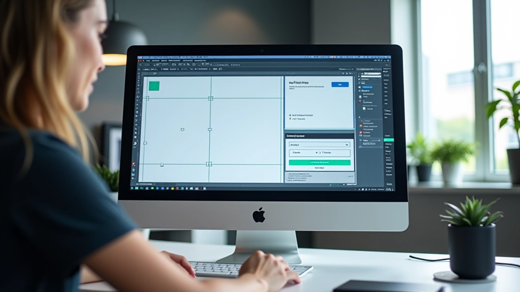
Everything starts with containers. Not fixed pixel widths — those don’t work. You need containers that actually respond to their environment.
The secret is using percentage widths and max-widths together. A container that’s 90% of its parent will shrink on mobile but still have breathing room. Add a max-width of 1200px, and on desktop it won’t stretch to ridiculous sizes. You’re not fighting the viewport — you’re working with it.
Pro tip: Always use padding on your container, not margins on children. This keeps content from touching the edges on small screens.
Think of it this way: a fluid container that adjusts to 90% width will feel natural on every device. Throw in a bit of padding — maybe 1.5rem on mobile, 2rem on tablet — and suddenly your content’s breathing, not cramped.

Flexbox changed everything. Before it, people were hacking layouts with floats and absolute positioning. Now? You’ve got a real layout tool that actually understands what responsive means.
Here’s what makes flexbox perfect for responsive design: it’s direction-agnostic. You can stack items vertically on mobile with flex-direction: column, then switch to flex-direction: row on tablet and desktop. One property. That’s it. No media query gymnastics needed for simple stacks.
Key property: flex-wrap: wrap lets items flow naturally. If a row gets too crowded, items drop to the next line automatically.
Combine flex-wrap with gap — a property that adds consistent spacing between items — and you’ve got layouts that work from 320px phones to 2560px ultrawides without constant tweaking.
Media queries are your tool for deliberate design changes. Not every layout needs to shift at every viewport size — that’s overthinking it. Most projects work fine with three breakpoints: mobile (up to 768px), tablet (768px to 1024px), and desktop (1024px and up).
The real skill isn’t writing media queries — it’s knowing when to use them. Don’t create a breakpoint just because a number exists. Only break when your design actually breaks. If your layout looks good up to 1200px, don’t add a breakpoint at 1100px.
Mobile-first approach: Start your CSS for the smallest screens, then add complexity as viewports get larger. This keeps your base CSS lean.
You’ll typically adjust padding, font sizes, and flex directions. Maybe columns become narrower or cards rearrange. The goal’s always the same: make content readable and navigation usable, no matter the screen size.
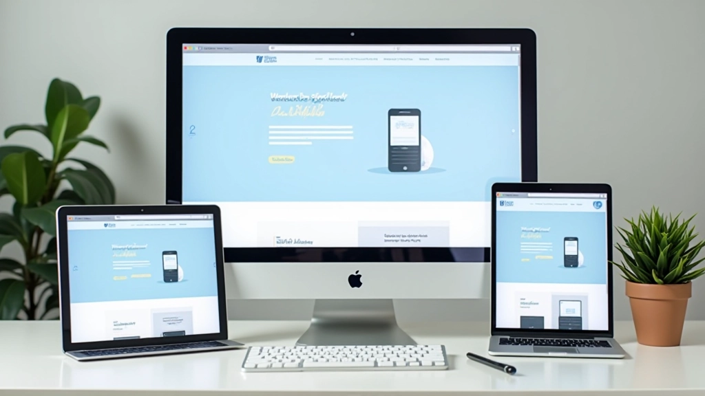

Theory’s great, but responsive design lives in testing. You’ve got to actually see how your layout behaves at different sizes. That’s not just about Chrome DevTools — it’s about real devices.
Test on actual phones if you can. A 375px phone viewport is different from a 768px tablet, and both are different from desktop. You’ll catch weird spacing issues, text that doesn’t wrap right, or images that overflow. Real devices show you problems that emulators sometimes hide.
Common gotcha: Don’t forget viewport meta tag. Without <meta name=”viewport”>, phones treat your site as desktop-sized and zoom way out. Always include it.
Once you’re testing, you’ll refine. Maybe a card needs less padding on mobile, or text needs to be slightly larger for readability. These small tweaks make the difference between “it works” and “it feels right.”
This article provides educational information about responsive design principles and techniques. Responsive layouts vary based on project requirements, device capabilities, and user needs. We recommend testing your designs across multiple devices and screen sizes during development. Browser compatibility and performance considerations may require adjustments to the techniques described here.
Responsive design doesn’t have to be overwhelming. You’ve got flexible containers keeping your content centered and properly spaced. You’ve got flexbox handling layout direction based on screen size. You’ve got media queries for the moments when you need explicit control.
The websites that work everywhere aren’t built by accident. They’re built by people who understand these fundamentals and apply them thoughtfully. Start with a solid container strategy, lean on flexbox for layout, use media queries when the design actually needs them, and test on real devices.
That’s it. You’ve got the foundation. Now go build something that works on every screen.
Explore more web design fundamentals and techniques to strengthen your front-end skills.
Browse All Web Design Articles